Tuesday, October 18, 2016

New in the Studio

I am enjoying working with Nu-pastel sticks and have recently increased my supply.  The narrow, square sticks encourage me to make angular, directional strokes giving an energy to my painting that I was not able to achieve with the soft, rounded pastels.  I also find that I have more control and can see what I am producing better.  


Here you can see the Nu-pastel sticks grouped 
according to warm and cool colors.

Friday, October 7, 2016

Painting Glacier Faces with Watercolor/Pastel

Glaciers are awe inspiring.  They are so huge, cold, exhibiting a silent, creeping power.  The glacier is not just white ice but radiates colors of blues, greens, oranges and pinks.  So much to study and communicate with my paints. 

Here are a series of glacier faces I have rendered using the watercolor/pastel technique that is demonstrated in this blog.


This was my first attempt. 
For the watercolor underpainting I used viridian green, aureolin yellow, cadmium scarlet and cobalt blue.

I secured the top edge of the glacier by developing a mountain behind using soft pastels.

Pastel was also added to the sky area to create a misty atmosphere, blending it
into the mountain edge. 

Only a minimum amount of pastel was applied to the glacier face.  


Working more detail in this glacier face I secured the top edge of the ice with muted pastels of dark green, violet and gray. 

The base of the glacier is defined by the water also executed with pastel.


Perhaps my ice would be more credible if I placed in into a glacier-environment: Mountains, water and a second glacier in the distance. 


I did not find this composition satisfactory, so . . . . . 


I redesigned it!

One of the great things about working with pastel is that it can be reworked I removed the pastel from the top of the painting, first with bristle brush and then with a kneaded eraser.

I then added a mountain contour and a water line. 


Here is the finished painting.


The snow covered Alaskan range identifies the location.  The soft, cool colors make the viewer think "ice". 

Notice all the color in the mass of ice.  Glaciers are not simply white ice. 


 This rendering is done in a horizontal format. 
 
 
I originally thought that a vertical format would be the best choice to communicate the glacial ice.

I am glad to have tried the horizontal format because to my eyes it represents the massiveness of the glacier better.

Saturday, September 10, 2016


Painting Alaska


Returning from a wonderful trip to Alaska filled with new subject ideas I just had to use my watercolor/pastel technique on the icy Pacific Glacier.

Alaska landscape opened my eyes to a new pallet of colors.  The atmosphere and summer lighting was inspiring. The powerful, majestic Alaska range was calling to be painted.

Pacific Glacier, Glacier Bay, Alaska

Watercolor Underpainting
  
 Bold, cool colors to suggest the ice and snow were laid down 
on a sheet of wet watercolor paper (Hot Press 140#).


 Painting in Progress
 
Using soft pastels the mountains and glacier were developed.
Cool blues and violets tempered with some warm brown were used
to create the texture. 


Finished Painting
Pacific Glacier, Glacier Bay, Alaska
Securing the mountains with pastel in the sky area,
 tightening up edges, defining the water line
 and detailing the glacier brought the painting to completion.


Wednesday, August 3, 2016

Now that we have thought about representing trees in watercolor/pastel, let's look at applying what we know.

Pastel Drawing over Watercolor Underpainting

   When underpainting is thoroughly dry begin drawing your subject with pastel. 


 Bold Underpainting

Underpainting can be bold and abstract.  Think about your subject as you apply the watercolor.  In this case I am concerned to suggest the direction of growth, their posture and position of the tree to be drawn on the page.  I want to select colors that will complement my foliage color.  I am concerned to establish rhythm and balance. I keep my final idea in mind but am not dictated by it.

When the underpainting is dry, I can superimpose a finished image over the underpainting being careful to leave some of the underpainting color alone and free from pastel.


 Applying Foliage
 
Let's take a closer look at the application of pastel to represent foliage.

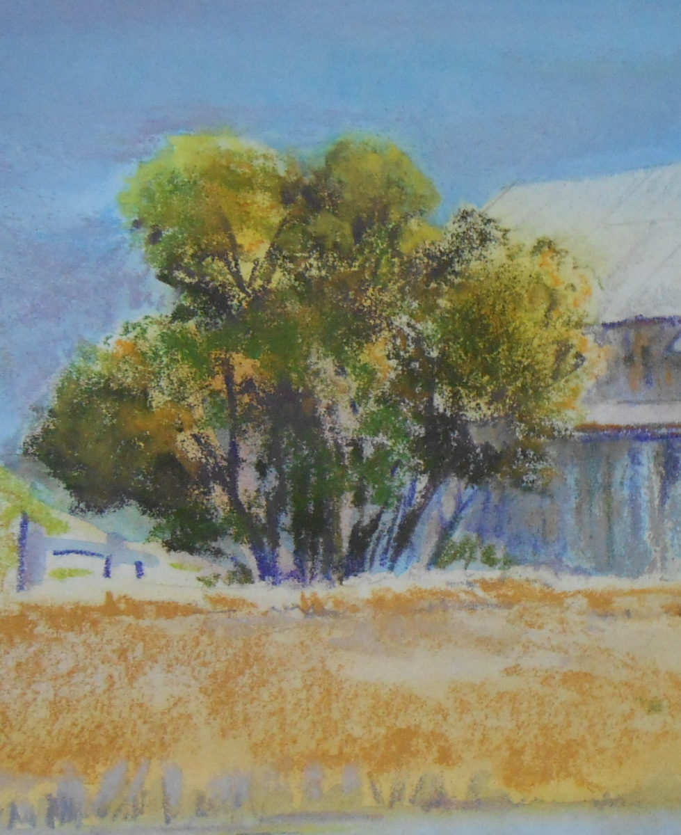
Here is a watercolor/pastel study of a massive oak tree that shades my patio.


Take a closer look at the foliage.

I have used a scumbling technique to create texture.  I have softened some edges.  But look how vibrant the areas are where I allow the watercolor color underpainting to remain untouched. The transparency of the watercolor allows the "white" of the paper to glow through. 


Outside edges can be secured with pastel.  This is especially useful for light value edges that were created with watercolor during the underpainting stage .

Note the green, white and yellow shapes on the right hand edge of the tree.  
By using lavender pastel and working around the light shapes the tree takes shape and form. 


The same technique can be used to secure the lightest side of trunks and branches. The light areas on the trunks of these trees have no pastel on them.  Their value and color is established with the watercolor underpainting which was applied at the beginning of the painting.


Tuesday, June 21, 2016

Study Trees


Let me share some things I have discovered by studying trees.
Trees in the distance can easily be identified by their shape.

   
By their silhouette we recognize them.
 So draw a the tree's shape to communicate its identity.

In addition to being cognizant of a tree's shape, we also need to consider its direction of growth, it's gesture and its personality.  Yes, trees have personality or at least they suggest certainly personality traits.  A tree can be strong and resilient like an oak or delicate and lyrical like a willow tree.  Also remember, a tree is alive, growing upward to catch the sunlight's energy. 

Look for the tree's personality.

                    Strong                                   Graceful                             Stately

Keep this in mind as you draw your tree.
It will help you represent the distinct character of your tree.  


As you study your tree, note the dark and light shapes.
These give your tree form.


 Shadows falling on a tree trunk give form and shape to the trunk.
Note how the shadows follow the contour of the trunk.  


Trees cast beautiful shadows on the ground that echo their limbs and foliage.


About green trees.  The foliage that we read as "green" is really made up of several different hues.  More about greens in a future post. 


Juxtaposition yellows and blues to produce the illusion of green.
 Note how tooth of your paper can work to create texture for tree foliage.


  The paper's tooth produces texture for rendering bark.


Study trees wherever you go.  Take lots of pictures to bring home to study at your leisure.  Use your sketch book to note and study the nature and character of the tree, its value patterns and habits of growth.  Indicate the light and dark areas in the foliage that give it form.  Remember, a tree is not flat. 


Friday, June 10, 2016

Trees - Watercolor/Pastel


A landscape painter needs to be competent in executing trees.  Distant trees are fairly easy to depict. They can be recognized by their silhouettes.


Simple identifiable shapes form rows of pine trees.


The challenge is when the tree is your subject or needs to be a part of your foreground.  I have spent many hours drawing and painting trees and still feel I have more to learn.  Here a some generalizations to consider:

Observe the shape of the tree.  The shape of the tree helps to identify the species.  Draw the contour of the tree true to its shape.


As you observe and draw the foliage think united masses of leaves, some in the foremost part, some receding to the back part of the tree.


This tree has three large masses of foliage.
Within the larger masses there are smaller ones.


Use at least three greens of different values when painting "green" foliage.


Soften some edges; leave some crisp.


Keep foliage light and trunk and branches strong.  The skeleton of the tree must support the weight of its foliage. 


With a pastel stick use negative painting technique, working  around your tree to bring it forward. 


  A sky-blue pastel is being used to secure the shape of the trees by working around them.

The tan mountain shape is worked around the pine tree in the same manner.  

Friday, May 27, 2016

My Basic Method


We have looked at tools and materials.  Now let's see how we can use them to create a painting that makes use of the best of both mediums: watercolor and soft pastel

You might want to try this subject just to get started, but the procedure is much the same with any subject.

On watercolor or mixed media paper create some loose beautiful watercolor washes on a wet sheet applying the colors you wish to use.  They should be different than the color you will use for your subject to create surface interest and more color excitement.   Keep your final subject in mind but be free with your color.
 
  Note that I chose Aureolian Yellow and Permanent Rose for the underpainting knowing that my subject would be completed in shades of green.  Aureolian Yellow and Permanent Rose blend together on the wet paper to produce a beautiful scarlet.  The yellow gives warmth and the rose gives contrast.

When the watercolor washes are dry, indicate your main shapes with pencil. 

Note: I have used a dark pencil so you can see the drawn shapes in the photo.  Use a light pencil for your work; it is only to be a guide.


I have chosen to leave the sky area alone, so I will work on the band of ocean next.  Working from the top to the bottom helps to keep the work clean.  And remember we want to stay out of any areas of watercolor we want to remain clean and vibrant.  Choosing three values of color I apply them to the ocean shape, grading the color as I work towards the line of vegetation on the land.  Blend this area keeping out of the other areas (tree and shrub).  Use your favorite blending tool for tight spots.  


To keep a clean edge at the horizon, use an eraser shield as you
blend the colors into the paper.
 

Next is the line of vegetation.  Use three different values of muted greens and scumble the pastel stick so as to allow some of the underpainting and texture of the paper to remain. Soften some of it if you like. 

Note how the watercolor underpainting glows through the vegetation.


Next, tackle the tree shape.  Think: direction of growth.  Use minimal strokes.  Leave some of the underpainting showing through.

Again, use three different values, blending where foliage is dense. 


I think you can finish the rest with no more specific directions.  Just remember that your lightest areas are created by the watercolor and the pastel is used only to clarify the subject and act as a strong contrast to the watercolor.