Glaciers are awe inspiring. They are so huge, cold, exhibiting a silent, creeping power. The glacier is not just white ice but radiates colors of blues, greens, oranges and pinks. So much to study and communicate with my paints.
Here are a series of glacier faces I have rendered using the watercolor/pastel technique that is demonstrated in this blog.
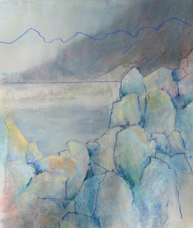
This was my first attempt.
For the watercolor underpainting I used viridian green, aureolin yellow, cadmium scarlet and cobalt blue.
I secured the top edge of the glacier by developing a mountain behind using soft pastels.
Pastel was also added to the sky area to create a misty atmosphere, blending it
into the mountain edge.
Only a minimum amount of pastel was applied to the glacier face.
Working more detail in this glacier face I secured the top edge of the ice with muted pastels of dark green, violet and gray.
The base of the glacier is defined by the water also executed with pastel.
Perhaps my ice would be more credible if I placed in into a glacier-environment: Mountains, water and a second glacier in the distance.
I did not find this composition satisfactory, so . . . . .
 I redesigned it!
One of the great things about working with pastel is that it can be reworked I removed the pastel from the top of the painting, first with bristle brush and then with a kneaded eraser.
I then added a mountain contour and a water line.
Here is the finished painting.
I redesigned it!
One of the great things about working with pastel is that it can be reworked I removed the pastel from the top of the painting, first with bristle brush and then with a kneaded eraser.
I then added a mountain contour and a water line.
Here is the finished painting.
The snow covered Alaskan range identifies the location. The soft, cool colors make the viewer think "ice".
Notice all the color in the mass of ice. Glaciers are not simply white ice.
This rendering is done in a horizontal format.
I originally thought that a vertical format would be the best choice to communicate the glacial ice.
I am glad to have tried the horizontal format because to my eyes it represents the massiveness of the glacier better.


